Hydelines. What are they and how are they used?
The process of developing a smartphone app is always quite complex, and with that, a specialist, a professional working on it, immediately thinks of hydelines. But one needs to understand the term and understand what it is?
The main purpose of a smartphone app is to help solve a user’s problem in the shortest possible time. And sometimes seconds are very important.
What if every app came out unique, with its own interface and look and feel, and extra features? The user would then spend a lot of time trying to figure out the interface and understand everything. And it would then take a lot more time to solve the problem.
But in order to speed up the process and solve all the problems, guidelines are used.
In fact it is a set of basic recommendations which developers offer for improvement and optimization. And due to this all the information looks uniform. Hydylines describe absolutely all the principles of smartphone software navigation and additional actions.
On top of everything else, guidebooks can greatly reduce not only the development time, but also the investment.
Why do you need to use the guidebooks?
Actually, the point is very simple. There are several reasons why you simply can’t do without them:
- It speeds up the development process in many ways.
- It does not require a lot of investment.
- The interface is as simple and fast as possible.
- The design process is accelerated.

Varieties of
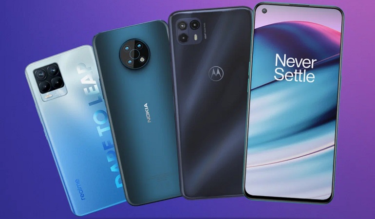
Google Material Design System.
The second variant appeared with Android 5.0 back in 2014. And almost immediately it became a full-fledged design system and is often used on other platforms. Of course, at first it served for the Android OS.
In this situation, the depth of the interface is worked out first and foremost. But interactivity and animation are always given their due attention.
In fact, absolutely everything that could be required is present here, from fonts to plug-ins or icons and so on.
And all the examples are there to build up an understanding of what can be done and what is not recommended.
Apple Human Interface Guidelines
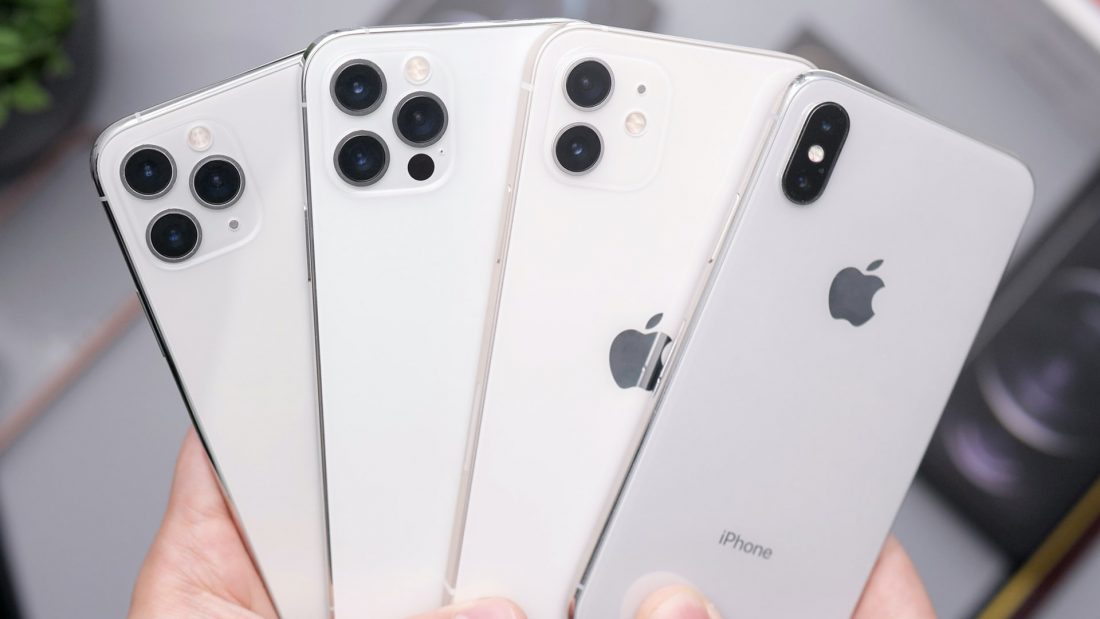
Together with iOS 7, this guide appeared in 2013, and since then it has been continually expanded for use with other operating systems.
The main idea here is ease of viewing, as well as the airiness of the interface. Content is the main focus, while the interface is not given as much attention.
There are no clear rules and no specific specifications. For example, there is no option to see the size of the buttons. At the same time a number of other elements are simply missing. But there is a lot more scope and freedom.


